Choose primary categories shoppers recognize
Group products by their purpose or intended customer. Use familiar labels and link to collections with real merchandise. Reserve predictable locations for contact, delivery and returns so shoppers can find policy details quickly.
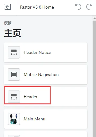
Connect each theme area to the relevant menu
After editing menus, check which menus the current theme uses in its header and footer. Verify that nested categories open and search is visible. Remove duplicate links and empty collections. In multilingual stores, check translated menu labels and destinations.
Test mobile navigation with specific tasks
Use a phone to locate a common product, a specific size and the shipping policy. Make sure the menu opens, closes and responds to touch and keyboard input. Count the steps in these paths before adjusting the category hierarchy.